Prudential Singapore: National Insurance Provider Website Revamp
Background
Prudential is an international company offering a wide range of products in insurance, savings, and investments.
I created two initial design concepts (desktop and mobile) for a Prudential pitch, aimed at showcasing a more modern, user-friendly approach to their digital experience. These concepts focused on improving usability and aligning with Prudential’s business goals, helping support the successful outcome of the pitch.
After the project was won, I worked on the wireframes and final UI designs based on in-depth research conducted by the external vendor and our own heuristic review and competitive analysis. The final designs refined the original ideas into detailed, implementation-ready layouts for both desktop and mobile.
The main objectives were to enhance the digital presence to match or exceed competitors, improve the online user experience, and simplify content management.
All concepts followed a persona-based approach, enabling users to achieve their goals more easily and intuitively.
Client
Focusing on the users
When the project was officially kick-started, we started working on developing the real design concepts. This process started with a deep analysis of research findings from other vendors and our own heuristic analysis. We also conducted research on Prudential’s competitors, examining their strengths and weaknesses.
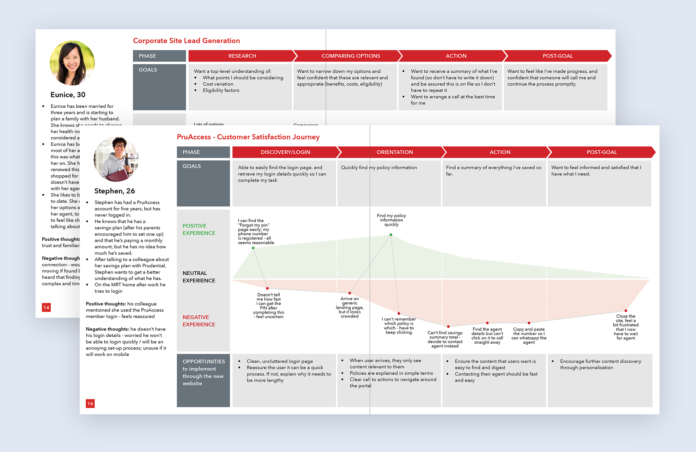
The user-friendly design needed to be based on user research findings. Our user flow and navigational pattern creation process was fully driven by our target audience and deep client insights. I built experience maps for our personas to provide a clear representation of obstacles and missed opportunities for our users. The findings from user interviews and usability testing on the current website helped us shape the final design solution.
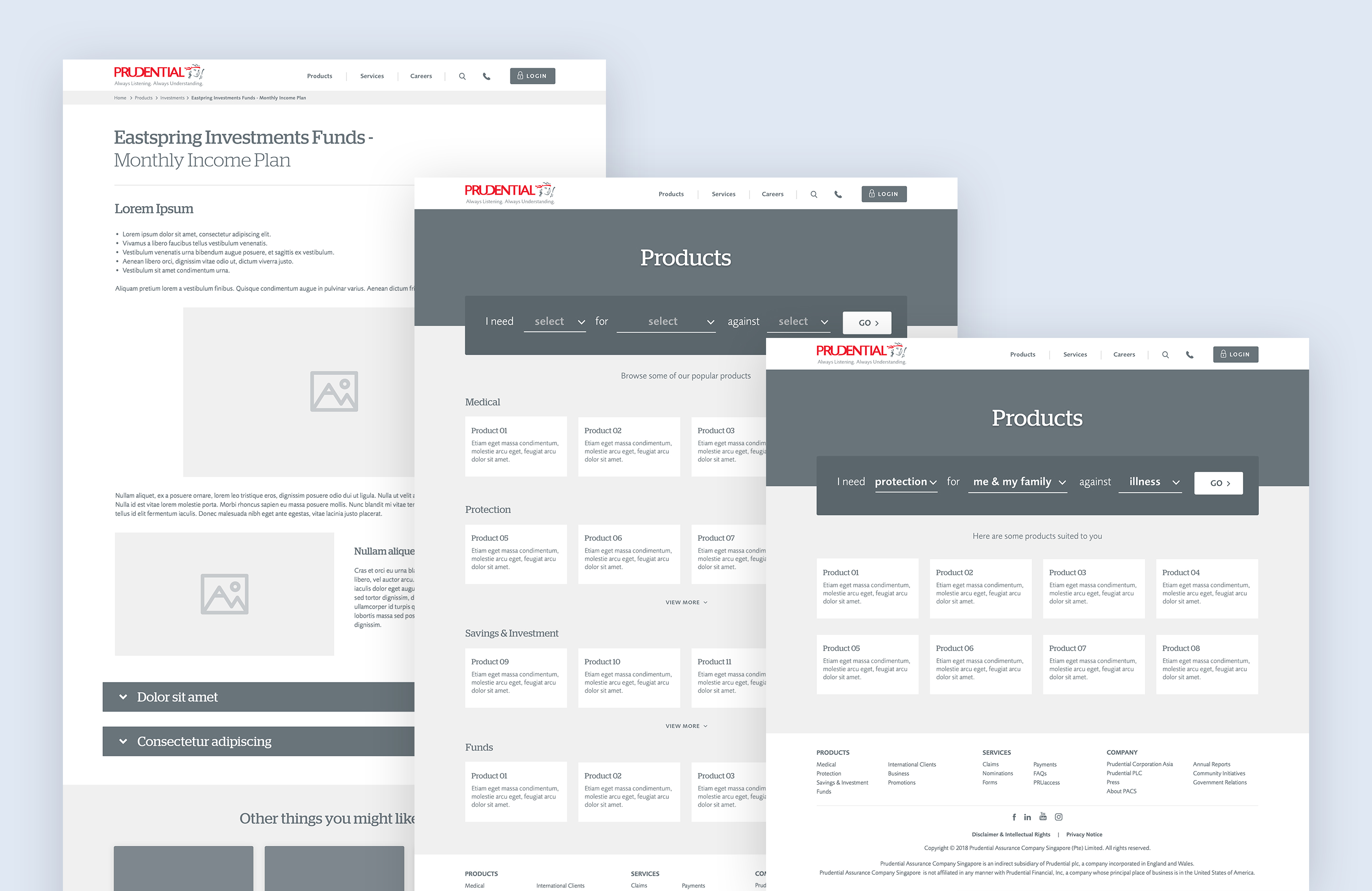
Wireframe concept
For all the important templates, we first framed the solution using wireframes and then iterated based on input from stakeholders and users.
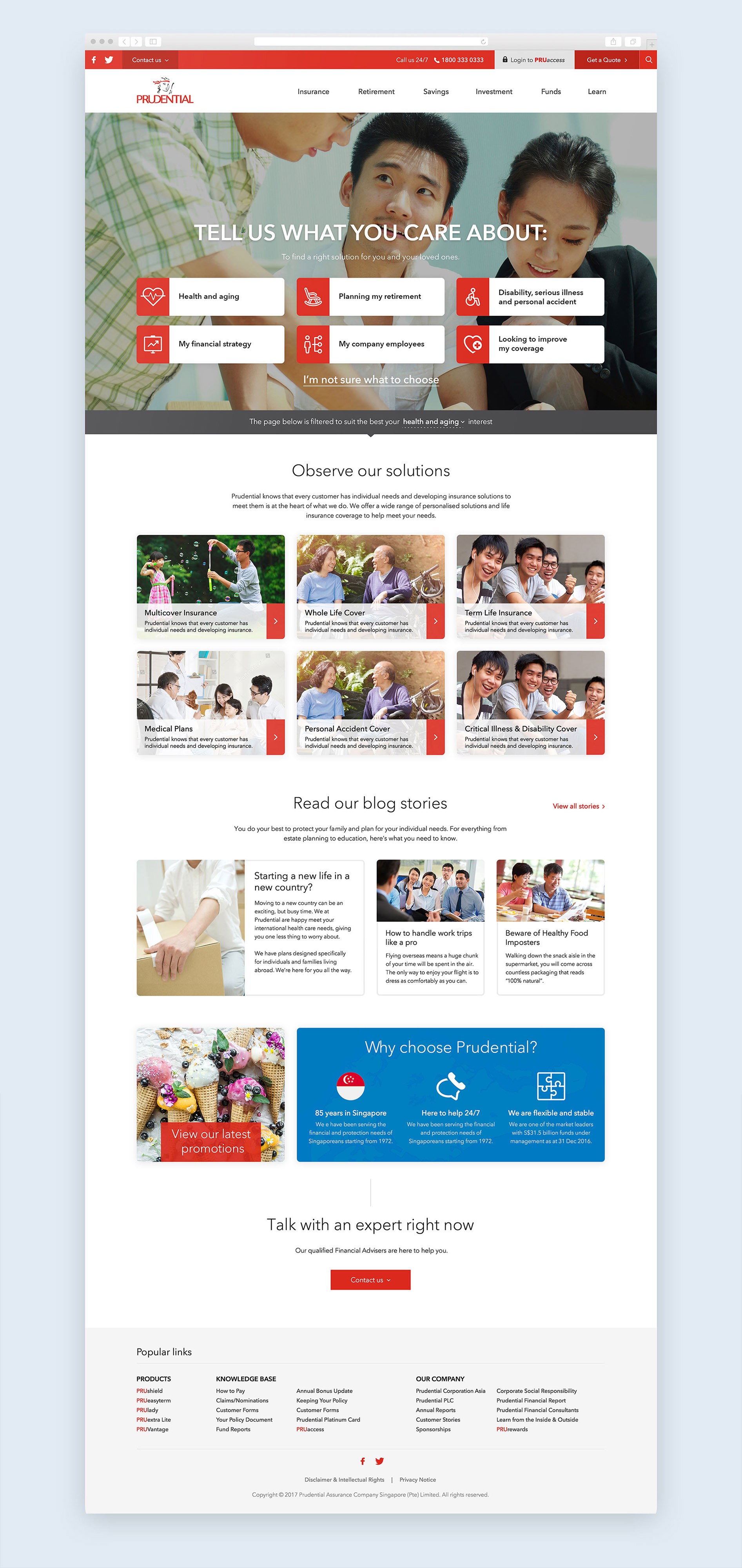
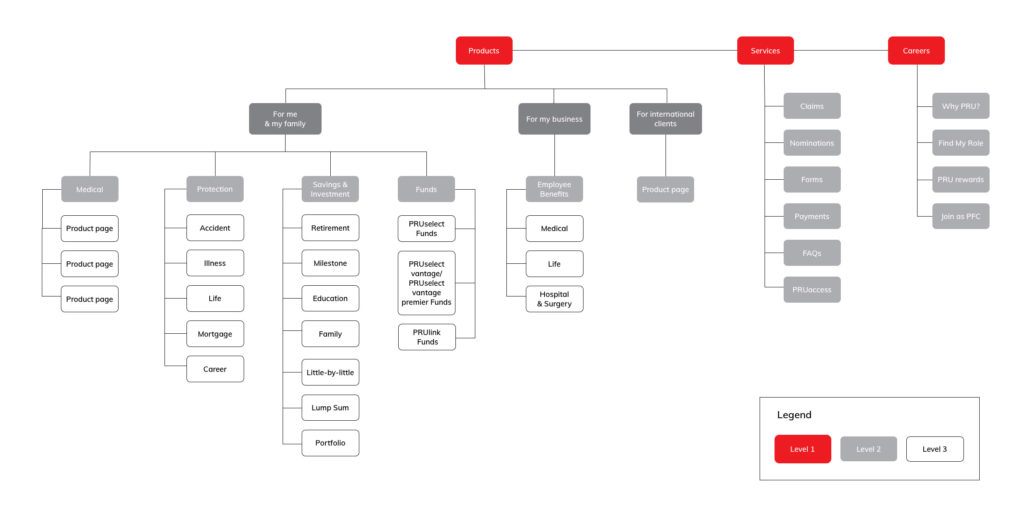
Improved navigation & IA
We based our IA and navigational patterns on the outcomes of user research and a card sorting workshop. The design goal for both was to achieve greater simplicity and to distribute information across the website in a clear and logical way.
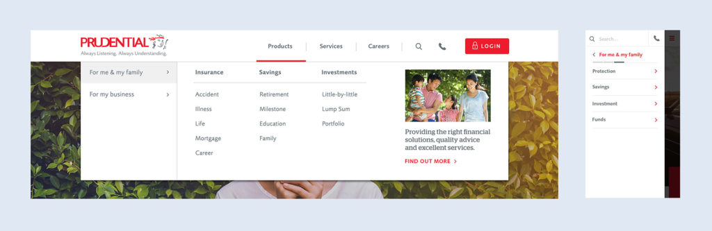
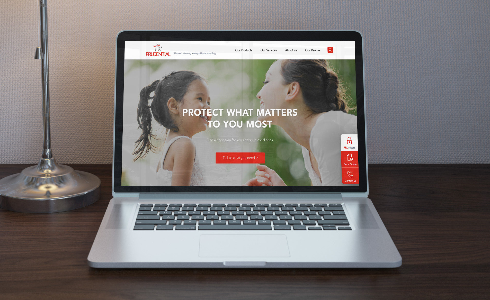
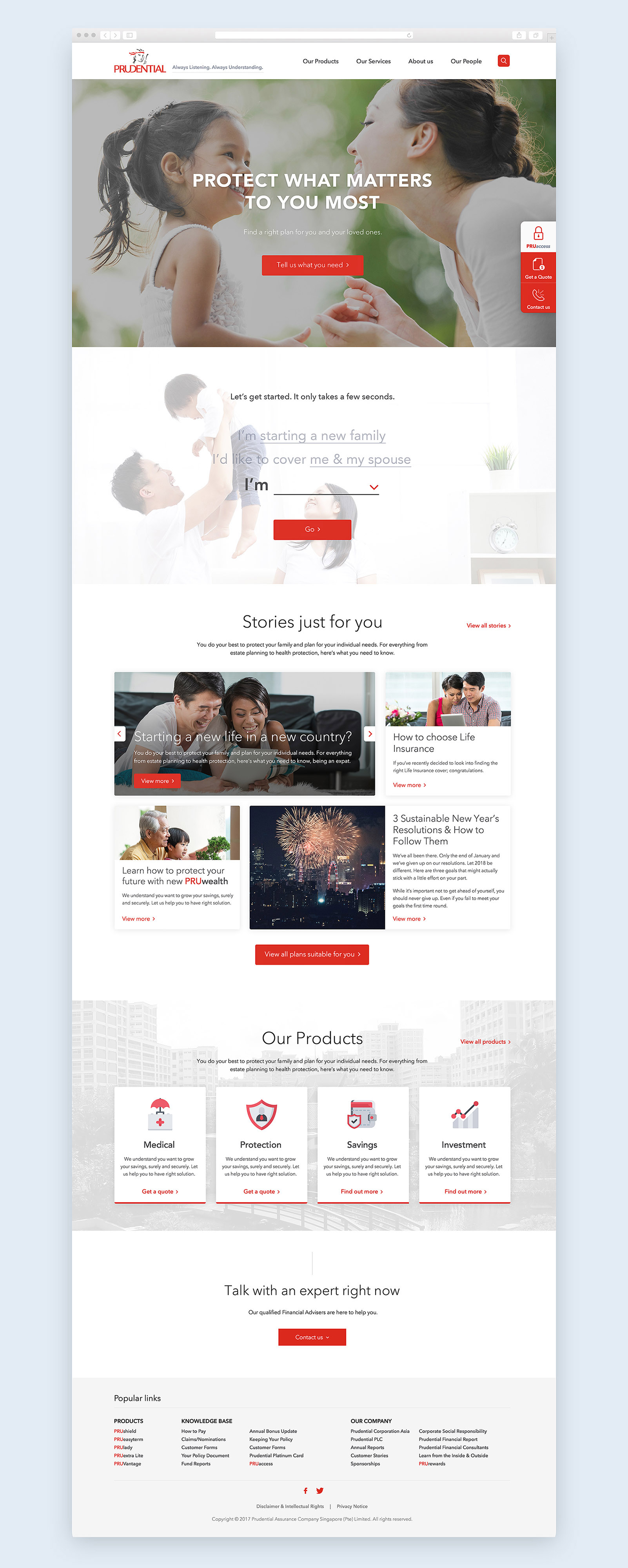
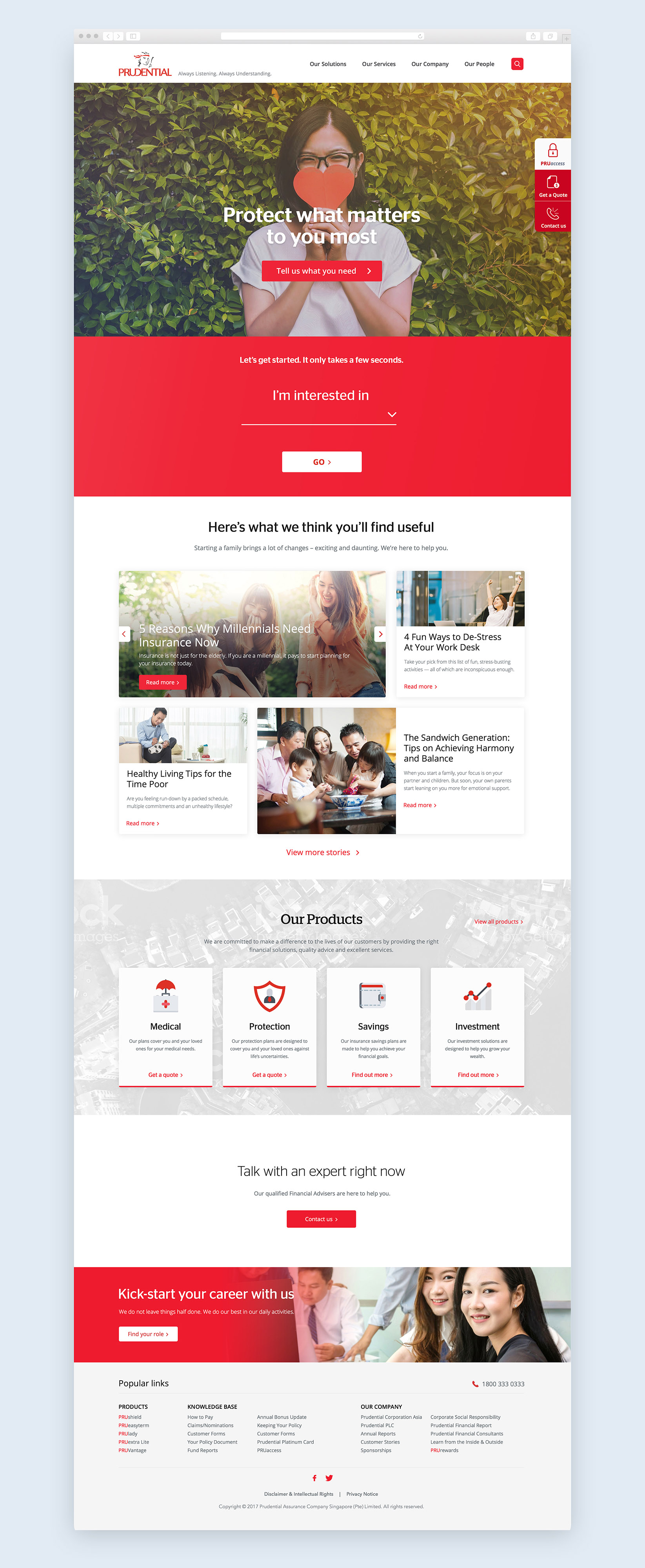
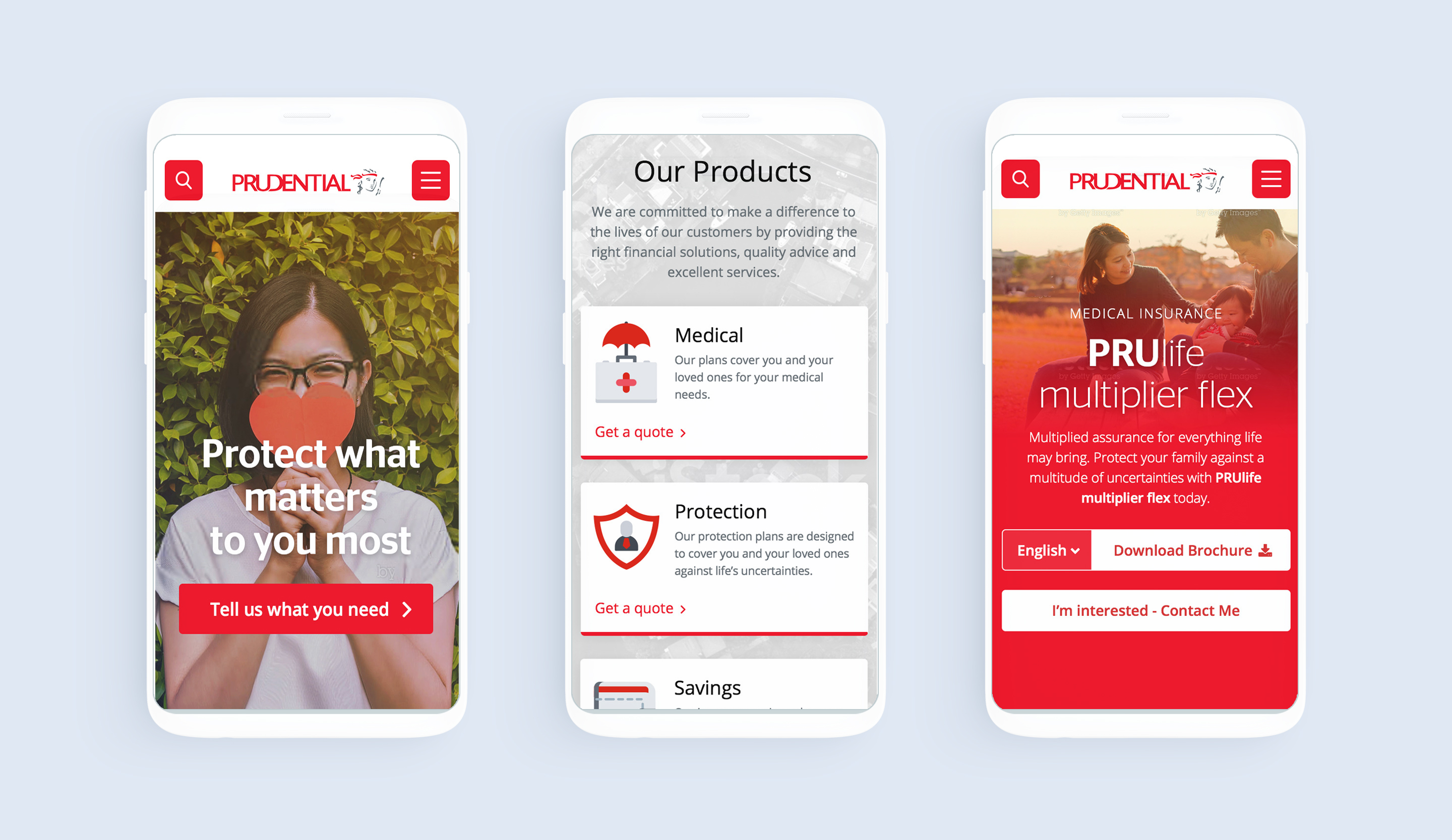
Final Design
We iterated on our initial design concept through client feedback and user testing to arrive at the final solution. It is fully responsive, modern, and user-friendly.
Client
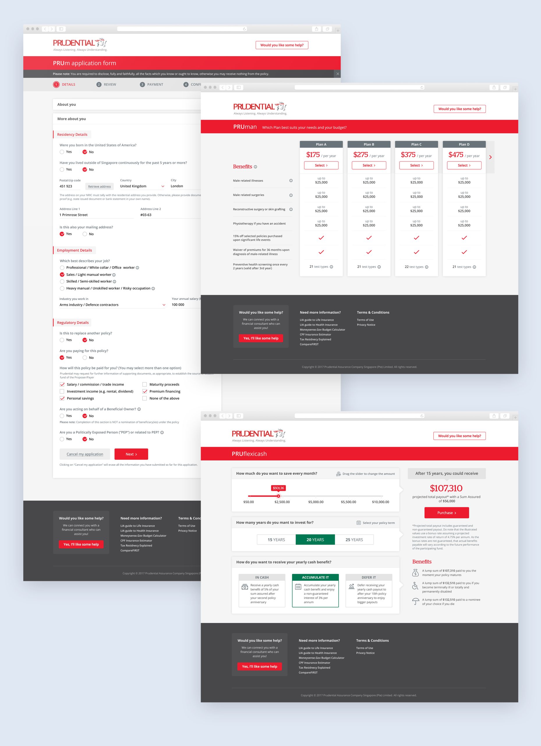
PruAccess: Plan Management Portal
Following the main portal redesign, we have also worked on the plan application and management platform.